Thursday, September 30, 2010

the ugly duckling

8x10 oil on linen
Do you know that story The Lucky Duckling? It's the story where the swan hangs out with the ducks and everyone thinks she is ugly...not knowing that she is a swan. Well..I am sure hoping one day I will be a swan...but for now it's the ugly duckling all the way. Funny way of saying that as I morph away from what I understand- painting plein air every day, producing a new work each time- to working from my stored memory I am seriously suffering from the uglies. I reread  Carlson to remind myself why I really need to make this change." The memory exaggerates the essentials; the trifles of incidents tend to become blurred...Until mastery of memory is reached, the brain refuses to act as a filter. "
Without the filter you record the information but the mood needs to be the most important.
My recent change in  content has actually made some subscribers leave. I am very sad to see them go, but I have to do what I have to do.
Quack.

PS I will hopefully be able to post part three of Lynne's interview tomorrow.

Wednesday, September 29, 2010

underpaintings

I hit the magic number today 1111 posts! I did the math, that's an average of 370 a year! My three year birthday is in a few days.Yay!
Back to creating. Here is an underpainting that is really imprimature. Technically, an imprimature is a single colored, somewhat transparent value painting. Its job is to set the mood.  Brushstrokes are a no-no, so I do mine with a paper towel, OMS and a couple of q-tips. I  slide it around like watercolor- similar to  the watercolors underpaintings I do for pastel. Next I brush on some Liquin, which makes it settle into the canvas more and not lift off at the next stage.
A second step, that I sometimes skip, is a full value painting with white and one other color, click here for an example. This is more of a true underpainting. For landscapes I prefer burnt sienna and transparent earth yellow. For an interesting read about underpaintings and Corot's method check out Sadie's detailed description of her idea of Corot's working method here.
 second glaze...more to come

Tuesday, September 28, 2010

nocturnes/dusk/Whistler and my struggles


 Whistler, Nocturne in Blue and Silver: The Lagoon Venice
Lately I have been studying the light of the early evening hours. It's always good to go and look at inspiring works as well. Who  better to look to than the man himself?...Whistler. Downtown in the Freer Gallery of Art there is a wonderful selection of his gorgeous nocturnes.
My special interest is in his blue nocturnes of Venice and the Battersea bridge. For these he painted on a deep red or mahogany panel. It glows through the thinly layered blue/gray paint. That's what makes the blues sing. Whistler painted with sweeps of color..just the perfect sweep..no more no less. If it wasn't just right he would wipe it off. Because of the beautiful "simplicity" In his time Whistler's nocturnes were not considered "real art." They just seemed too easy... Oh to be that good!
Whistler said that his palette was where the painting took place. He felt that once all the colors were mixed on the palette the painting was almost done.  So much precise thought went into making a beautiful harmony. He pre-mixed all his colors.  For what I understand his colors included: raw sienna, raw umber, yellow ochre, cobalt blue and then 3 reds, an orange red- I think - vermilion, Venetian red (cooler, bluer red), white and black.
Below was my first try three layers, all wiped away...already!
Below that is the second start. I felt more burnt sienna was necessary before putting the blue/grays on top. It was too light and there was no glow. Never be satisfied with OK, it must be right.
More as it develops.

Monday, September 27, 2010

september harvest moon

 9x12 oil on gatorboard
Each night I walk to  the soccer field next to my house to watch the show...the sunset. Usually the colors tend to be orange, red, hot. This was later and by now it had a beautiful, wispy, neutral violet cloud at the horizon. Civil twilight it's called, about 1/2 hour after sunset. For many evenings last week the full moon was present heavy in the distant sky. On this night the sun  easily stretched its arms high from underneath the ground plane, coloring the sky with its rich glow. The grass was the hardest to do for it always seems too cool. To counter act that I painted a warmer red underneath.
This is a studio piece. You can see the underpainting here.

Sunday, September 26, 2010

Lynne Windsor interview, part two


Early Morning, below Gordes 12x24 oil by Lynne Windsor

Lynne's interview continues:

L-What inspires you to paint?

Lynne- Honestly, I just love painting! I love everything about painting. I feel as if I was deprived for a long time now I am allowed to do it. I have so much to do. I wish I could clone myself!

L- How do you keep motivated when it gets tough in the studio?

Lynne- Well, I pace. I get up and go to the garden and pull weeds. Sometimes I take a break and get something to eat. Sometimes, I give up...when it's not working I just stop. I give myself migranes when I continue the battle.

L- What is your daily routine?

Lynne- I am up and working in the studio by 10:00. If I am not I start feeling anxious, sort of edgy. I need to be there. I paint till lunch time. A few days a week I go play tennis with my good friend Sue, another English woman. It's mad English women in the noon day sun! Exercise is so good for the brain. I try to make time to do some each day. After lunch/tennis I am back to work in the studio.

L- People admire your ability to create  the mood of the landscape, a special place, very dreamy. Would you summarize how you do this both from a technical standpoint and a mental standpoint?

Lynne- When I paint I always start out with an underpainting of burnt sienna. I like the warmth it provides. Next I add the dark/shadows. Now the push and pull begins. I work mostly with opaque paint in the beginning. I am not a painter to intentionally use the same color in all different parts of the canvas.
I do keep the entire painting soft. I will actually fuzz it and blend so that not hard lines exist. I use glazes to gray down the distance and warm up the foreground.
Each painting has a "mother color." And I find burnt sienna to be very helpful tool to "kill the brightness."
My palette is somewhat traditional- cobalt blue, cerelean blue, ultramarine blue, burnt sienna, cad yellow deep, cad red light, cad yellow light, white and two new favorites: garnet red (Lefranc) and Williamsburg's permanent crimson. I also use the transparents: indian yellow and transparent brown oxide.
Lynne painting in her studio in New Mexico
You may look forward to -getting ready mentally and more in Wednesday's blog post.  In the meantime check out Lynne's website and blog. You are in for a treat!

Saturday, September 25, 2010

twilight study/memory

4x6 pastel on paper
Another memory painting. Each evening I walk out to the soccer field and observe the light. It amazes me that the landscape has a built in harmony that can be reduced to just a few colors. This time I simply used a burnt sienna, a melon colored orange, a yellow and a couple of blues. This is a study for a bigger oil I will begin tomorrow.

Friday, September 24, 2010

Interview with Lynne Windsor

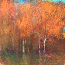
winding river, tweed valley, by Lynne Windsor

Was I ever lucky when Lynne Windsor agreed to speak with me!  Her work is amazing as you can see from the photo above. Dreamy.... you wish the landscape really was that way. If you haven't seen her website or blog  click here and feast your eyes!
This was a phone interview as  Lynne lives in New Mexico and travels often and for long periods to her homeland England. When she answered the phone it was as if we were picking up a conversation that had ended abruptly moments before. She was warm and gracious, sharing stories and technique. I felt as if I made a new friend!

She was reeling from etching day and packing to get ready to leave for a 5 month visit back home to England, where her father and her adult children still live.  Etching was something she did long ago, but when moving to New Mexico Lynne found an oasis in the Santa Fe Etching group,  lead by  Eli Levin, a brilliant etcher. When I asked she said she wasn't quite sure how it feeds her painting, but it was definitely a way for her to draw more. After chatting for awhile we began the interview.

L-Please tell us  little about your connection to the UK.

Lynne- I am from the east coast of Great Britain, an area called "the wash." The landscape is flat with drained marshes. Not too far from home there is a softness in the distance. rolling hills, color, light.  I am still very connected to my home as my 3 grown children, my father and many friends are there. The landscape inspires me. I can't wait to get back there. I will definitely travel to Scotland, where a very close friend of mine lives. I consider it a second home...and I adore the landscape!.

L- Why are you an artist?

Lynne- It goes back my influence from an early teacher. I was enthused with drama and came to the States on an exchange program to train  in drama. I was only 15 and was staying with a family. One day I drew one of the children and the host mom liked it so much exclaimed "you should be an artist." Well, I had never thought that I was good enough, but that made me think. Upon returning my art teacher was so encouraging. From there I went to Art College. Life got in the way for awhile, now I feel like I have no time to waste. I have so much to do so I work all the time.

L-Please talk about your study.

Lynne- Michael Workman changed my life. When I was in England I was mainly a figurative painter. First I met Barry(her husband of 17 years and a landscape painter) and he influenced me. I painted the landscape in his style. But I felt queasy, it wasn't me. Next I was fortunate to attend a Michael Workman workshop at the Fredericksburg Art School.. His work made me stop. The muted colors, pure beauty. I was changed. Something had happened. I have learned more about myself since then. Pushing myself. When I am struggling I still look at his work. It gives me confidence.

Which artists do you admire, past or present?

Sherri McGraw (figurative), Stuart Shils(more abstract), Turner-his later works, Whistler's nocturnes, Daumier, George Inness. Honestly I love all painting. I wish i could clone myself. I want it all. I feel like I was deprived for so long and now I am finally allowed to do it.

More next time...... technique, routine etc.

Thursday, September 23, 2010

more underpaintings and Lynne Windsor

both are 9x12 oil on gesso with marble dust on gatorboard
Here are the  two new underpaintings I have been working on this week. The light will be sunset and early evening twilight. I added more white and transparent earth yellow in the bottom one as an experiment. We will see.
You are probably wondering why I add marble dust to a ground for oil painting. The truth is the first time I did it, it was by accident. I was in a frenzy. Idea filled and excited, I picked up what I thought was a smooth gessoed panel. I began painting and realized I like a little bit of drag/texture. Oooooh I like this. And so goes the story!
.
On another note: you are in for a real treat as tomorrow I will post the first installment from my interview with Lynne Windsor. Last Friday afternoon I had a wonderful phone conversation with Lynne. I have admired her work for a very long time and was delighted when she agreed to talk.
I must admit it takes me awhile to organize and type up an interview, so I do it in slices. While you wait, take a moment to check out Lynne's GORGEOUS work- website and Blog.

Wednesday, September 22, 2010

studio update

Here are the two paintings I have been working on for the past two weeks.  Neither is finished. Glazes take time and patience. Waiting till each layer dries before placing the next is the biggest challenge. When I know what I have to do next, but can do it, it's like constantly holding onto the reins. Yipes!

Tuesday, September 21, 2010

tree study with glazes

Today the goal was simply a tree study.
The method was to concentrate on optical mixing. This can be done two ways (that I know of): glazing and side by side color (like pointillism.) When glazing you do not reach for the right color you make it through layers of color. Gold with blue on top makes a golden green. It's sometimes hard just not to reach for the color you know you want. The watercolor underpainting helps because with it I choose the glow colors and make the skeleton on which to build.
At a certain point I rely on temperature contrasts to create vibration.

Monday, September 20, 2010

after you have critiqued

The next step after you have critiqued your paintings (excerpt from Elizabeth Mowry workshop, see Saturday's post for the first part)
Then the choices are:
*Is it possible to make alterations on the painting without overworking?
*Knowing that by making changes, the painting will be overworked, but you are will to sacrifice it in order to learn.
*You decide not to alter the current painting but will keep in mind how you would prefer to do a similar subject in the future.
Okay. So you have made a painting that looks exactly like what you were looking at......

Now ask, but could it be better? Could it say more? How?
FORMAT-Is this the best one for this kind of subject?
SPACING- Could I vary or improve the spacing between components?
DETAILS- Are there distracting areas that compromise the main idea?
HORIZON LINE PLACEMENT- Better higher or lower? Did I give the most important idea the space it needs?
COLOR- Am I really happy with the color palette?
Are the colors dull or boring? Or garishly causing tension?
MAIN IDEA- Is the idea clear or are there several ideas competing?
LINE- Is there an elegance and grace of line within the painting?
EDGES - Should some of the edges be softened? (or more defined?)
CENTER OF INTEREST- The center of interest reads stronger when the contrast, purest color and important details are in that area.
Are some of the areas of the painting obviously overworked?
Is the technique generally consistent throughout the painting?

Sunday, September 19, 2010

glazing:pastel and oil

about 8x14 pastel and watercolor on wallis
For the past couple years I have been trying to find my way with glazing with oils. My oils before were always alla prima, even when big studio pieces. Recently have I intentionally tried to overlap the method from oil to pastel. The methods had been very separate in my repertoire  for a long time. The painting above  is a good example of the overlap.
watercolor underpainting on wallis
This morning when I traveled out to the lake I planned in my head how to "glaze" the layers. I began with watercolor and tried to use sections and broad sweeps of glazes (light layers that cover more blanket like than marks). I saved the marks to the end and used them sparingly.

Saturday, September 18, 2010

how to critique your own paintings

Recently my  good painting friend, Christine, was fortunate to take a rare workshop from Elizabeth Mowry. The next day she and I shared a long telephone conversation about the workshop (and more.)  I am posting a small, but very important morsel about critiquing your own work.
.
When we are back in the vacuum of our studios, producing painting after painting, we often struggle with critiquing our own work. It's challenging to be objective, unless you let time pass. Well here is another way for those of us who prefer not to wait a year or so for clear eyes. I plan to use it often.

1. Set up five recent paintings. Study them carefully.

2.Put them in order beginning with your favorite to your least favorite.

3. What are the qualities that you really like in your favorite painting? Why?

4.What are some things you do not like about your least favorite painting?

5. What in each of the others could you alter so that it would have more of the qualities that are in the one you like best? What can you do specifically to numbers 2,3,4, and 5 to make them better?

It is important that you go through the whole process and thoughtfully answer all the questions out loud.  Next I will post what the choices are after you have done your assessment.

I have been working glazing 4 paintings here is one that has a few layers much more to go.

PS Thanks Christine!!!!!

Friday, September 17, 2010

electricity in the light

The goal was to try and feel the light. I found that the use of discord colors was very important for creating the electricity I saw. Notice how much is lost in the photograph?

Thursday, September 16, 2010

The Importance of Plein Air Painting


About a week ago I was rereading an interview with Joseph McGurl that really made an impression on me. It was in American Artist, March 2009. Here is the piece I hear over and over again in my brain.

AA: What is your plein air process? How important is it to you to create on-site studies and sketches, as opposed to using photographs as references for your studio work?

Joseph McGurl: I am trying to portray my response to the real world—not a flat visual representation of it. I am trying to paint the whole tree, even the side you can’t see. I am also trying to paint a living tree that will die in the winter and bloom again in the spring. Science has taught us that space and time are not static and that on the subatomic level there is a frenzy of activity. Knowing this, I cannot paint from a photo that is devoid of all these realities. I am also trying to understand nature in the most complete way possible, and studying it intently while interpreting it in paint is the most effective way I know to accomplish this. The challenge of going into the field with just my paints and coming away with a useful picture is also appealing. Sometimes I don’t have enough time to capture a certain effect, but that’s just the way it goes. It’s difficult relying on just my own observations, and it may seem easier to paint from photos, but my goal isn’t to do it the easiest way but the best way. Like everyone, I sometimes have tendencies to be lazy, and if I know I have a photo to back me up, I may not look as hard or work as long at the sketch as I should.

With this on my mind I left the house to paint this early morning.While "the product" is not a good painting. It did provide me with  tremendous insights about the light.    If I had just looked at a photo I would not have know the numerous small nuances of temperature shifts or the way the left tree seemed plum colored bu really the light had affected it to also have a ochre green glow on top. So my advice agrees with Joseph McGurl...nothing replaces being there. The more saturated you become with noticing (whether by practicing memory paintings or plein air) the better a painter you will become.                            

Good news for all my blogger friends who reply through the email feedburner sends to you.... my good friend Domi fixed the email reply!!!! Yay! So if you have replied to my daily email and haven't heard from me, don't worry I haven't ignored you. It never got to me.

Wednesday, September 15, 2010

plein air at the field

Finally I returned to my field love.  I had my plan firmly in mind and have had it there for over three weeks. When I arrived at the time noted on my sketches the light was very different. (Shows how quickly the light changes at this time of year.) The sun had barely crept over the trees...still it was beautiful. I painted the light that was present and plan to use the sketches and plein air piece to work in the studio. I simply can't wait to see the autumn light on this very special place.

On another note, I want to thank everyone, again, for all their support and input as I wrestle with my blogging decision. I also want to send a special thank you to all my blogger friends who emailed me very personal notes. I will answer each one in time.  You are all wonderful!

Tuesday, September 14, 2010

more work on the underpaintings and thank you

First, a giant thank you for all of your thoughtful responses to yesterday's question. I must say I had absolutely no idea that my blog mattered to anyone else, but me. Thank you for all of your kind words. I am thinking and sorting out the possibilities.
In the meantime here is more work on the underpaintings. I am working with Deborah Paris online again. She told me that, in order for my underpaintings to be useful for glazing, they needed to have more information. That way I can decide later if I wanted to take it out, but when glazing you can't add it later (unlike alla prima painting.)
And my new routine- a quick morning memory painting. The sky was green gray and the low fog was blueish.

Monday, September 13, 2010

Thoughts and Questions about My Three Year Blog Birthday


As my blog approaches it's third birthday (Oct 4th), 1090 posts and counting, I have been thinking and questioning. Oddly enough it almost seems sacrilegious to question my blog and its purpose, but I must.

My blog, a long time friend to me, needs a change. The necessity of posting daily, which I have taken so seriously, much to the annoyance to many family members, is the issue. Is it helping or stymieing my growth as an artist?  I often find that my work schedule is wrapped around that need to post. My posts are sometimes uninteresting and simply a post. 

When I began my blog October 4, 2007 it was as a discipline. Finally I had the joy of painting full time and teaching only part time. A celebration. I wanted to be accountable for my time so that I would never fritter away this hard-won victory. A Painting-a-day blog was my answer.

Now, fast forward...... and I find the need for accountability is not there. My "need" to paint is so embedded in me that it could be considered an obsession. Now I wonder, is need to create a small painting each day distracting me from the larger goal of creation. My work en plein air has grounded me and continues to help me understand light and I will never leave it. But who is the steering wheel, me or the blog?

Yipes! This has been in my head for a long time. As I purge my thoughts I am relieved and uneasy at the same time. So tell me bloggers, I am certain that you have met this challenge as well. Please take a moment and share your thoughts. Folks without blogs (we love you too), I am sure you can relate, what is your experience?

Thanks y'all!

Sunday, September 12, 2010

memory dawn

8x8 pastel on canson
I have been studying the moments before the sunrises. Not painting it, studying it. Memorizing it is HARD....but it is the true essence. I long to play the memory game Whistler played with ease.
Finally today I allowed myself to take my distillation and put it in pastel. I have noticed the land is cool and dark and the sky is always the more neutralized version of color. One interesting thing I did not know. The colors seem to touch complements. What that means is as the sky moves higher the greyed yellow green touches a color that is pink violet . On the other side of that cloud it is violet grey and the sky has more yellow. Maybe it's just me. What have you noticed?

Saturday, September 11, 2010

"glow" underpainting

I have never been able to create the glow I desire with  a traditional underpainting. So I continue to search for the way that will work for me. The underpainting on the left has been painted with an assortment of colors (cad yellow, alizarin, ultramarine blue, white and sap green)-leaning warm. On the right is the underpainting I posted yesterday with transparent earth yellow rubbed in.
These last three underpaintings were created  of places I know deep down inside of me, I can see them in my sleep. No handshakes this time.
One thing is constant, they are all on gator board, with gesso and sometimes marble dust. Uncertainty is something I relish. Sometimes I think I paint just to amaze me.

Friday, September 10, 2010

underpaintings:colors

Two oil underpaintings. The underpainting is the set-up, it decides the most important things-value and feeling. A couple of things I know:
1. hard edges aren't your friend.
2. make this small statement have a full understanding of the value.
In these two I am playing with the color variable. This one is made in a kind of payne's gray -like color. I mixed ultramarine blue, cad red light and cad yellow to make the "perfect" gray-not warm not cold. I am not quite sure if there is a perfect gray. This underpainting is for an early morning painting...cool light. I think I will add a warm glow layer over it when it dries.
This one is painted in Shale, a color made by Vasari. It's a little warmer than my mix, nice for landscape. Tomorrow I will post a third, one made in "glow colors."

Thursday, September 9, 2010

location, location and meeting another blogger/artist friend

9x16 (i think) pastel and watercolor on wallis
Today I had to deliver two paintings to the show at the Washington County Fine Arts Museum so it gave me an opportunity to pass through gorgeous, rolling farm lands. On the return trip I met fellow artist/blogger Donna Timms and we did the two things artists do: chat about art and paint. This was my first time in this area so I felt that this painting was like a handshake. I can already see how I can revise it (on another panel) in the studio. It seems that I became wrapped up in creating what I saw, which is never my goal. A first painting in a new spot is like that. At least, for me, it takes a while before I can move  towards the essence the feel of the place. Does anyone else find that same pattern in their painting? Just a guess...it takes at least 10 paintings to warm up.....
This is Donna with her painting. It's hard to see in this photo, but it really is a little gem. Great to see you again Donna!

Wednesday, September 8, 2010

bittersweet sunset off Chain Bridge

8x8 pastel and watercolor on Uart
Last night, on my return trip from Dr. Joe, I decided to park by the bridge and battle the rush hour on the bridge. Chain bridge is one of the main  commuter connections between DC and Virginia. Yes, there is a sidewalk, the problem being is - the sidewalk is widely used by cyclists as a commuter route...making it a  very small space. The goal was to only paint what was necessary. Unlike Chinese landscape painters, the creation of a very specific light is my goal. This is the time before sunset, a slightly bittersweet time.  Attention to edge, neutral colors and large shapes reading from afar were my other goals.

Tuesday, September 7, 2010

the essence, the painting on a diet

I am rethinking just how much needs to be painted...so I return to value. My study of Chinese landscape painting has made me focus on negative space. A Chinese landscape painter uses shades of value and negative space to create a mood. Say less and the viewer completes the painting/drawing. Now where have we heard that before?

Monday, September 6, 2010

an "underpainting a day" and happy birthday Paul!

I just had time for an underpainting today. It's my husband's big 5-0 and I have so much to do for the party. The chair next to the underpainting is the "dicty throne." It's one of Paul's B-day presents. Paul is a cancer researcher at NIH. He works with small cells called dictyostelium and learns how they traffic and spread (and stop spreading-read cancer) The whole chair is designed around that organism and the bottom is filled with pictures of his life. There are more on the other chairs since it all matches our dining room table and 6 chairs. It will take  a very long time to finish and I am still in the process. Just a  little side job, when I am not in the studio:-) 4 chairs and counting.
Back to normal tomorrow!

Sunday, September 5, 2010

grackle morning

9x9 pastel and watercolor on wallis
Early morning on the canal, planted my feet in one of my favorite spots and painted. After finishing my painting and I started to pack up and the fiesta began. Oh, what an amazing sight! The skies above the canal were full of beautiful iridescent grackles. They were zig-zagging back and forth as a big group. I think they were migrating and feeding in mass. I stood mesmerized and watched. I will never forget that morning.
On another note, I just learned that yesterday's painting took first place in the Kensington Plein Air. I have never won a plein air contest...and I wasn't even at the reception...darn! I had planned to be there but I wasn't feeling well. I decided to take a nap...well the nap lasted about 15 hours. Now I feel much better, so back to business.

Saturday, September 4, 2010

kensington confluence

about 9x18 pastel and watercolor on wallis

The Kensington Plein Air Paint Out is today. It's always nice to do a local event. To do it you have to paint with in the parameters of old Kensington. This corner and another are the "out- liers" of the town and today the light was magnificent. Normally I wouldn't stand so exposed but this morning I felt bold.  There was a constant  flow of people and cars in the second hour of painting. One man even brought a number of his paintings for me to see. There are pluses and minuses to being so exposed.

My thoughts when painting this were about overall color harmony- the munsell complements- violet and yellow green and keeping the shapes bold, yet bathed in the morning light...contrast.
It's funny to me; it is soooooo recognizable where this corner is. Yes, I took some liberaties and played down the storage facility and parking lot, plus the loads of signage.....but still this confluence of main streets. It's a corner where I wait at the flashing light at least 5 times a day. To me it was so real, yet bathed in light, the way I want to see it. When I showed it to Paul, he didn't know where it was. hmmmm. Vision is a very personal thing.

Friday, September 3, 2010

study of Chinese landscape painting and explorations

Chinese master  and  my ink sketch
Chinese landscape is fascinating: the  painters are not primarily interested in how nature looks, but how people relate to it. The landscapes are meant to help people fathom out the intricacies of life itself by studying the landscape. The Chinese artists are not concerned with duplicating nature, but putting together the parts of the landscape in a compelling and significant way. A painting is the way to convey the inner landscape of the  artist's heart and soul.
When a Chinese painter goes into the countryside to paint it is most likely with a bottle or stick of ink and a brush. My guess is that ink makes an artist work faster and record only what is essential.   Students of Chinese painting do go into the  landscape to observe and sketch, however when they return to the studio they select elements and combine them to create a new vision with deeper complexity and beauty.

What I have understood from my reading:
*Examine what the landscape is trying to say to you.
*File it into your memory, write about it. (sounds familiar, right?)
*Try working with pen and ink. Quickly record  only the essentials.
So that is what I have been doing in my limited time this week. Carry ink with me and paint at any little moment. Using ink is CHALLENGING. It's much more permanent and unmovable than watercolor, pastel or oil. No matter how hard I rub with a paper towel the mark is there!  Yipes!

*Study master Chinese landscape painters

Thursday, September 2, 2010

value and the swimmer

5x6 ink and watercolor on paper

Value is the key. It tells the story. With that in mind I attempted my sunset peek-a-boo tree painting. But this time from my head.  The three front trees take priority and the back trees and "connectors" of value.
I will talk more about this tomorrow, as I am beginning my study of Chinese painting,

On another note, thank you to everyone for all your feedback about yesterday's painting. Hearing from all my blogger friends is like having studio mates. I really appreciate all your ideas. I knew something needed to be done. I was not satisfied at all. I will consider all the ideas and my own, then decide my course. You are all wonderful!

On still another note, this is the craziest week of the entire year for me. Because I teach part time in a school, there is one week in the beginning of the year when I have to work at school and help for a week's worth of long days. Each year I feel I go through a plethora of emotions during this week. First I am depressed and resentful to end the wonder of summer and stop my painting rhythm. (whaaaaa!) Then I get my thankful hat on and appreciate having such a good job, that I do like. Then I just bulldoze through. When the week is over and my work output is little and ideas seem over run I come back to life. It's like swimming underwater for 100 yards. Hold my breath, a little discomfort, then I pop up out of the water, wet and exhausted, ready to take on the next challenge. (I used to be a swimmer.) Bear with me.

Wednesday, September 1, 2010

discord, tone, George Inness and a question

12x12 oil on panel

This is a painting that I have struggled with for months and continue to struggle. It is a studio painting.  I have painted in this particular location on the C and O canal, so many times, for so many years, that I decided to use it as my muse for this painting. I felt that it's was simply inside of me. No need to be there, no need for photos of plein air paintings as reference.  The painting has gone through many metamorphoses. I question...would the water look better if it were lighter in front? What do you think?

I keep thinking about George Inness.
I  read George Inness over and over again. This particular part is streaming through my head.

Once after asking his son (a painter himself), "How does it look?" George Inness Jr. (the son) says, "Fine Pop, all right beautiful. Fine tone." The senior and master George Inness answers, "Yes, it has things in it, but it's stupid. Confound it! it's too good: it's all tone. That's what's the matter with it.  I've got too much detail in the foreground. That's the thing we are all running up against  to tickle the buyer- to make a few dollars.  Those weeds don't mean a thing. Let's take them out; they are not the picture. The picture is very good but it is all tone."  
The son replies," Yes Pop, but that's what I like about it, it's beautiful in tone.." Senior George Inness replies, " Perhaps , but that is what makes it stupid. Why in thunder can't I put something in it that's out of tone? You see there's no interest in this picture.  It's well drawn, yes, well constructed , well painted, and perfectly tonal;  but there's no passion in it. A picture without passion has no meaning, and it would be far better it had never been painted.  Imitation is worthless.  Photography does it much better than you or I could. In a bar-room in New York is a painting of a barn door with hinges on it and a key-hole. It is painted so well that you would swear that the hinges were real and that you could put your finger in the key hole; but it is not real! It is not what it represents. It is a lie. Clever, yes, but it gives you no sensation of truth, before you look at it you are told that it is a lie. The only charm in this picture is deceiving you into the belief that it is a real barn door.  Now in  art, true art, we are not seeking to deceive. We do not pretend  that  this is a real tree, a real river; but we use the tree or river as a means to give you the feeling or impression that under a certain effect is being produced upon us."

His words sit firmly in the front of my mind. As I look at this one now, after writing that, I wonder..is it too "in tone" and is need a certain amount of discord? It needs changes... but what?